Context
Therefore, during my years at the agency, I looked for a way that would allow me to tackle all projects quickly and without having to reinvent the wheel each time. Allowing me and the developers to focus exclusively on what was peculiar to the client and the project.
What I did
I designed a design system that was enriched over the years, first with basic components and gradually with more complex components. I defined naming conventions, workflow that helps me to work with the wireframe library for requirements gathering and to change this library to branded visual ui library according to the client brand.
Discover
Why a design system for a consultancy agency? What problems does it solve and what benefits does it bring?
Framing the problem
In an agency environment, designers are allocated to many different projects that need to be completed quickly and well, in this context, the problems to be solved were:

Consistency
Using standards that help users use the interfaces and facilitate development.

Efficiency
Speeding up design, dialogue and hand-offs with developers.

Scale
Solve interface problems once and adopt el solutions on all projects.
Define
Strategy

Strict adoption or with some exceptions? Independent or modular components? Who manages the design system?
To test the goodness of the solution found and to avoid adding complexity to the project, the choice was a rigid adoption of components on all projects tackled, with modular components and managed (design-side) by one person.
Touchpoints
What specifically needs to be created?
A design system is an organised repository of good design practice and principles, design patterns and reusable interface elements. This involves not only a repo for documentation but also tools, which facilitate the use of the design system within projects from design and development.
That is why the touch point was: The documentation of the patterns took place on confluence; The component library for the designs took place on sketch; The developed components were created in react.
Design
one touchpoint to bring them all together and bind them in the code;
Design pattern documentation
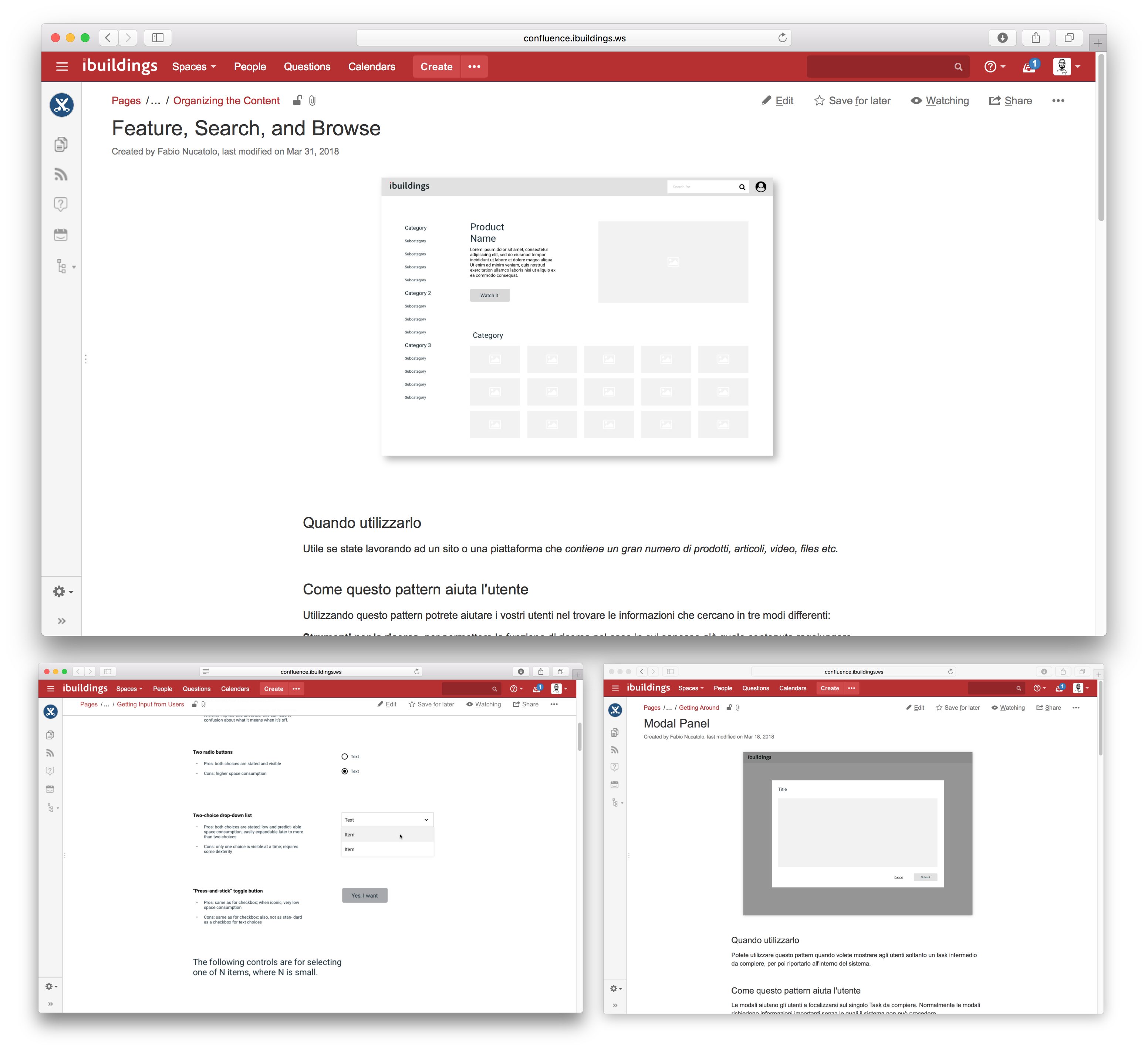
In the confluence library, design patterns have been documented and divided into three macro Areas:
Postural patterns
Patterns that help us decide how much attention the user should devote to interacting with the product and how the product should respond to users using it.
Structural patterns
Patterns that describe the structure and relationships that interface elements must have in order for users to reach a specific goal in a given context.
Behavioral patterns
Patterns that focus on the behaviour of individual UI elements or small groupings of UI elements. And on how these enable users to solve the individual tasks required to achieve a common goal.
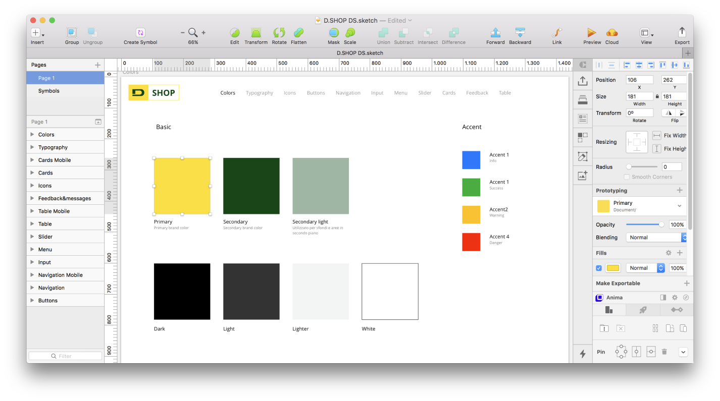
Sketch Ui library
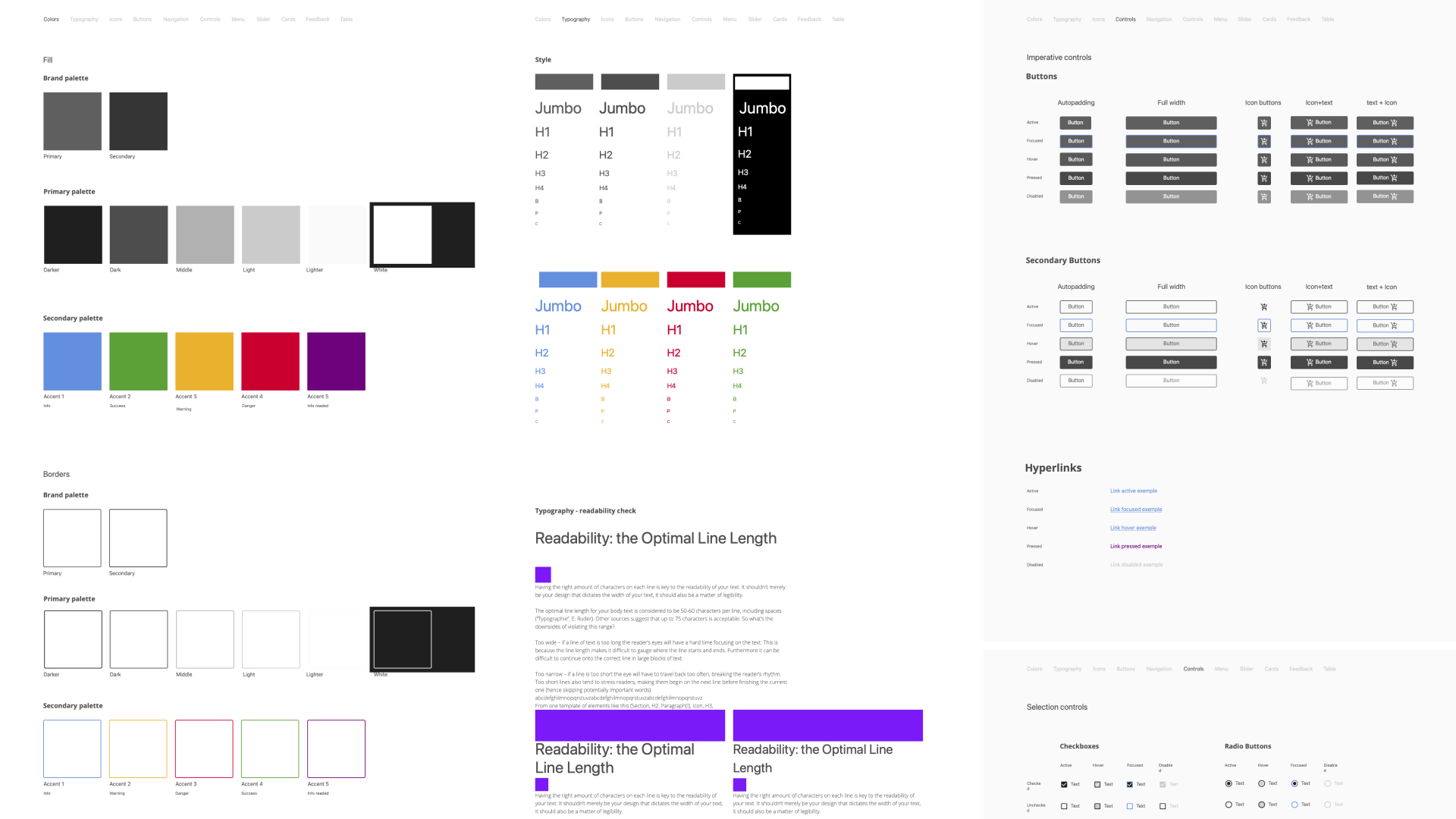
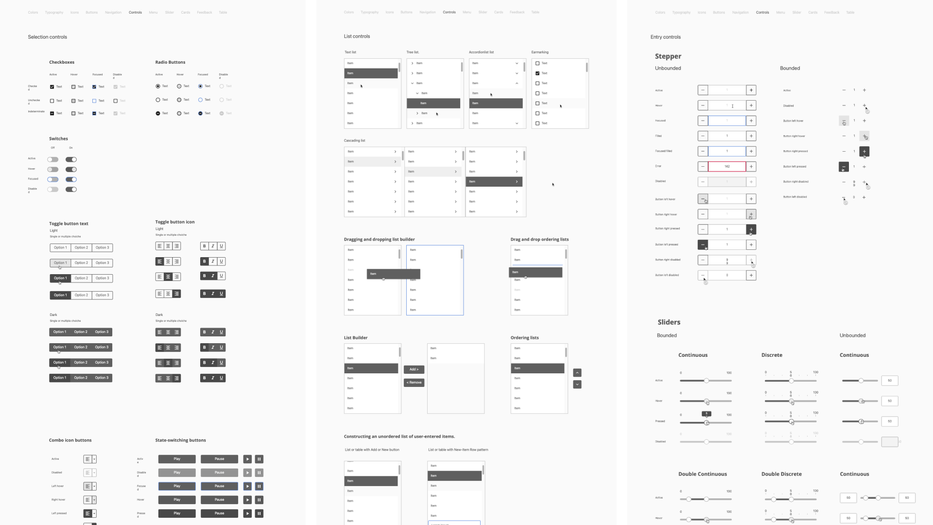
The unbranded Ui library was always used as the foundation for the design systems of the various clients I worked for. It contained all the basic elements (behavioral patterns), the nomenclature and the relationships between components and styles made it possible to quickly modify the library with the client’s brand colours.
Deliver
From patterns to components
A Ui library was created for each client, which is based on the nomenclature and components of the wireframe library. This library is customised on the basis of brand identity and integrated with specific components such as navigation components.
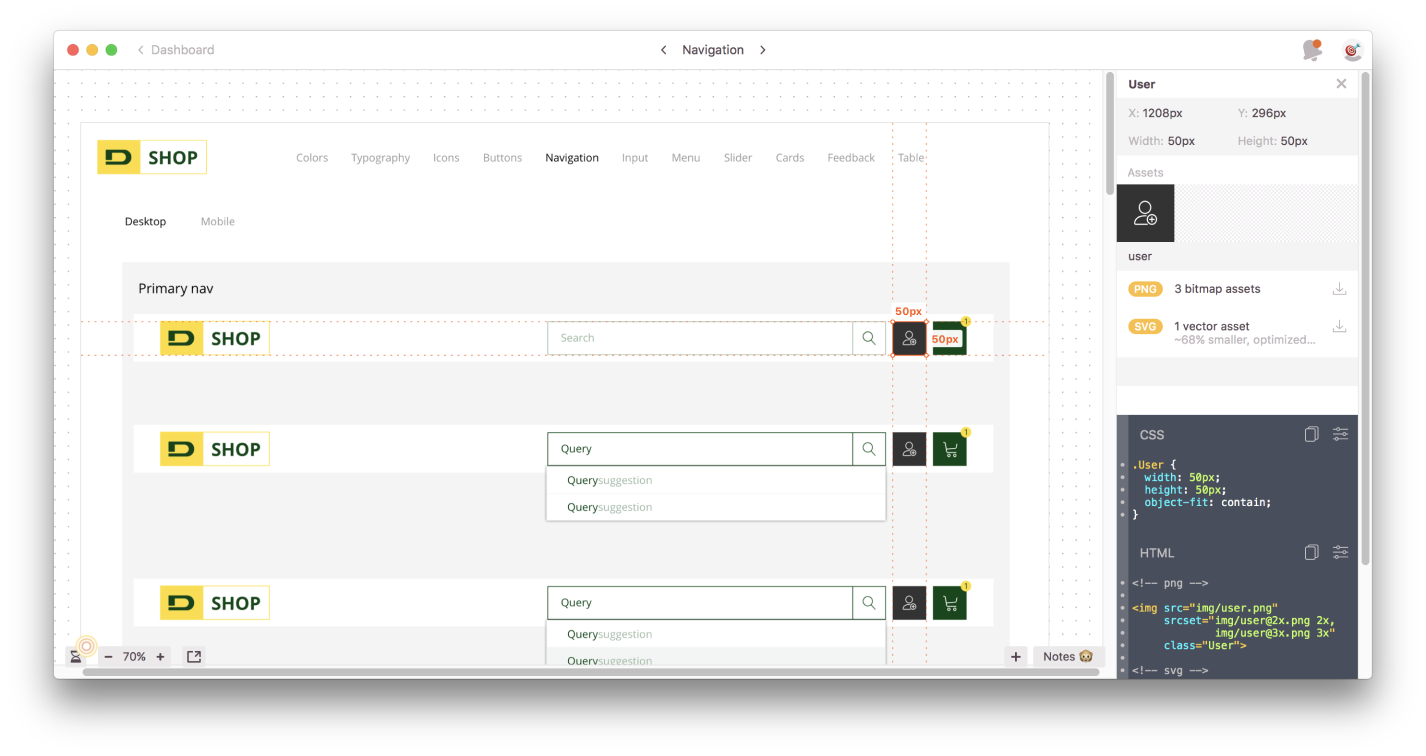
Once the library had been created, the individual elements were exported to zeplin, from where developers can inspect the components and have a reference for development. While the prototype in InVision remains a reference for understanding the pages, interactions and layouts in which the components are applied.
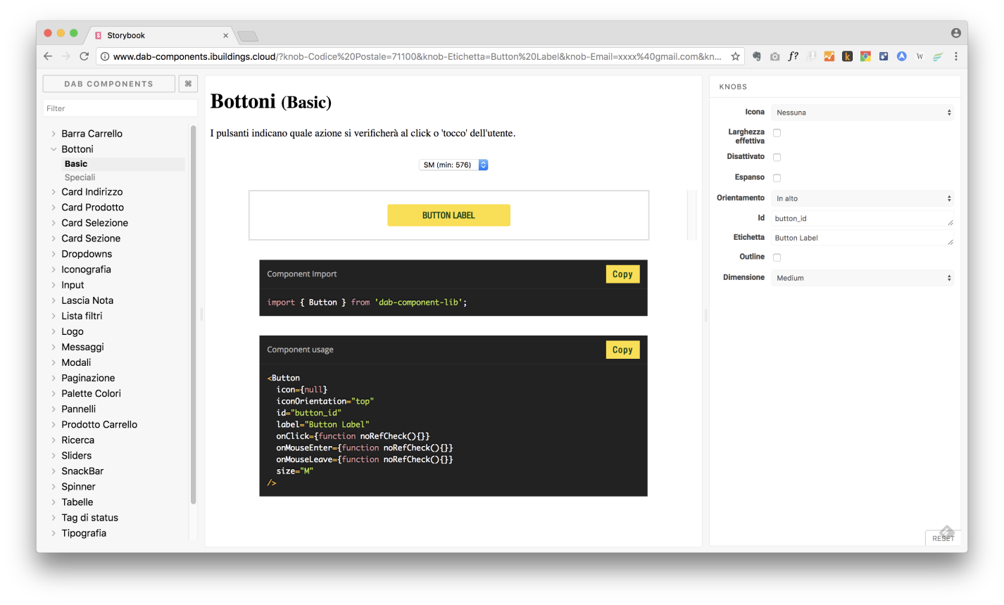
Storybook was the reference between Designer and Developer to do QA sessions on components and share with other designers all the possible uses available.